Overview
What I’m interested in looking at here will be some more strategic analysis of pitching, and specifically, pitch choices. For more background on this, see this post. In general, this has to do with pitch sequencing, or the order in which a pitcher decides to throw pitches (i.e. fastball, then fastball, then curve, etc.). This will wind up being quite complicated, so to start with, I’m going to try to restrict the problem to the simplest one possible.
Why is this important or desirable? Well, when we assess the pitches that are thrown by pitchers, we’d love to be able to know exactly where they’re trying to throw as well as which pitch they want to throw. However, only one of those decisions is truly observed – if a pitcher throws a fastball high in the zone, we know that they intended to throw a fastball, but whether or not they intended to throw it high depends on the ability of the pitcher and how well they located that particular pitch. So while we can hope to expand the analysis at some point to include pitch location, the lowest-hanging fruit is the type of pitch that they decide to throw.
Conventional Wisdom
I’m not very authoritative here – obviously mixing up pitches provides a strategic advantage, because different velocities don’t allow a player to consistently time pitches. But past this, I’m not going to pretend I have a huge amount of insight. I found this article interesting as well; the relevant part is reproduced below:
Aside from splitters (not a pitch we generally teach for a variety of reasons), sliders (SL) have the best Whiff Rate, while curveballs (CU) have the best Watch Rate. Fastballs (FA) are the easiest to throw for strikes and generate a lot of foul balls, but the primary reason to throw fastballs is to set up the other pitches. Change-Ups (CH) and Sinkers (SI) have very good GB% rates.
Everything works together. It’s important to realize the role of each pitch:
- Fastballs set the hitters’ expectations for velocity, location, and allow you to easily get ahead in/back into strikeout counts (at the risk of being the easiest pitch to hit)
- Curveballs should be thrown early in counts to tough hitters to disrupt timing and late in counts (2 strikes) to weak hitters who are likely to take strike 3 (at the risk of being a pitch most brutally punished when the spot is missed)
- Sliders should almost always be thrown late in counts to strike hitters out; giving hitters an early look at your left-right breaking ball is generally a huge mistake (at the risk of being a very hard pitch to throw for reliable strikes)
- Change-Ups should be saved for the 2nd and 3rd time through the lineup for a secondary “breaking ball” to get hitters out with; can be used for GIDP situations (at the risk of being a high-contact high-average pitch)
- Sinkers/two-seam fastballs should be used against opposite-hand hitters as you would use your fastball; lean on it heavily to neutralize the platoon advantage and minimize the # of four-seam fastballs thrown to opposite-side hitters (at the risk of being a high-contact high-average pitch) – Use sinkers/two-seam fastballs for GIDPs, though I recommend against this for pitchers not playing for elite college/select teams (how many GIDPs does the average youth team turn anyway?)
A few things to take away from this are that we definitely need to consider the platoon advantage (the handedness of the hitter and the handedness of the batter). It’s also important to note that these strategies are clearly for younger players (for example, the GIDP, or grounded into double play, considerations are significant at the MLB-level). And the GIDP consideration is particularly important, because ideally in our payoff calculations, we take into account the fact that this is a big win for the pitcher. In particular, using total bases (slugging percentage), as I did in the last post, will not account for this.
Analysis
First, it’s important to understand some of the basic parameters at play here. Here, we’ll actually use the data that doesn’t include 2019, as I realized that the 2019 data doesn’t populate the situational variables that we need.
I want to add on the pitch names to the dataset, which I won’t show because it’s ugly – these are again from the Kaggle source.
If you don’t know baseball, a good place to start would be to ask what the most common pitches are.
ggplot(full_data) +
  geom_bar(aes(x=pitch_name), fill = 'dodgerblue3') +
  scale_y_continuous(expand = expansion(mult = c(0, .03))) +
  labs(y = '2019 Pitches') +
  theme_bw() +
  theme(axis.text.x = element_text(angle = 90, vjust = 0.5, hjust=1),
axis.title.x = element_blank()) 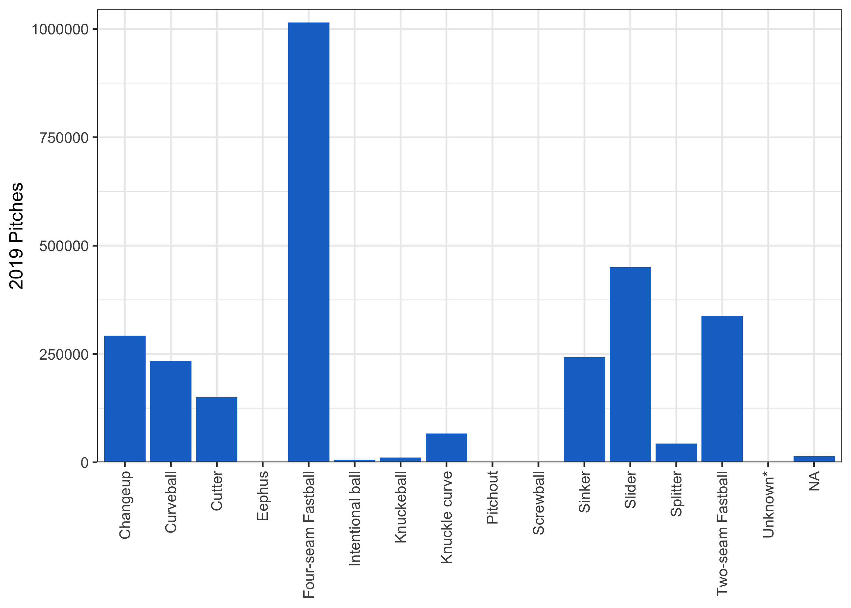
So there are a lot of fastballs! That’s pretty expected – the fastball is the first pitch you learn as a kid, and the easiest pitch to throw. Also, if we go by what the pitching expert says above, the fastball should set up other pitches, so we should see it pretty often.
The NAs are a little concerning – are they a merge issue on my end (I didn’t show the merge because it wasn’t very interesting code) or is it just missing?
table(full_data[is.na(pitch_name)]$pitch_type)##
## AB FA
## 14189 9 9So almost all of these are just blank pitch types, where we obviously cannot impute a pitch name, and 18 are pitch types that we don’t have a definition for. This doesn’t seem too concerning.
We might also be interested in understanding the number of pitches that a pitcher throws in general. How many options do they have when they decide which pitch to throw?
pitch_counts <- full_data %>%
  # remove pitch types that aren't real pitches
  filter(!(pitch_type %in% c('FO', 'PO', 'IN', 'UN')), !is.na(pitch_name)) %>%
  group_by(pitcher_id, pitcher_first_name, pitcher_last_name, pitch_type) %>%
  summarise(n = n()) %>%
  ungroup() %>%
  group_by(pitcher_id, pitcher_first_name, pitcher_last_name) %>%
  # don't count pitches that a pitcher throws fewer than 10 times in the sample
  # these are probably a hanging pitch that gets misclassified
  summarise(pitches = n_distinct(ifelse(n > 10, pitch_type, NA), na.rm = TRUE)) %>%
  ungroup() %>%
  # remove small sample pitchers
  filter(pitches > 0)

ggplot(pitch_counts) +
  geom_histogram(aes(x = pitches), binwidth = 1, fill = 'dodgerblue3', color = 'white') +
  scale_x_continuous(breaks = c(min(pitch_counts$pitches):max(pitch_counts$pitches))) +
  scale_y_continuous(expand = expansion(mult = c(0,.03))) +
  labs(x = 'Distinct Observed Pitches',
       y = 'Number of Pitchers') +
  theme_bw()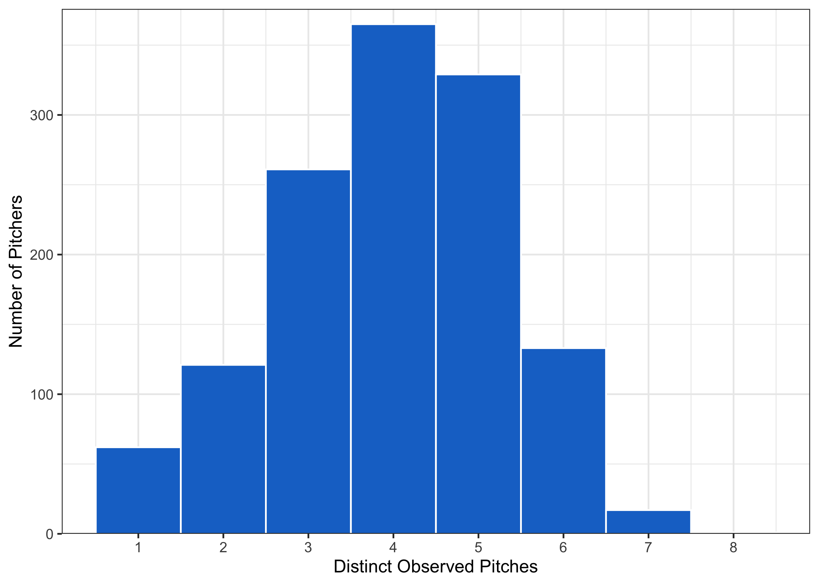
What does the upper end of this distribution look like?
full_data %>%
  filter(!(pitch_type %in% c('FO', 'PO', 'IN', 'UN')), !is.na(pitch_name)) %>%
  semi_join(pitch_counts %>%
              filter(pitches == max(pitch_counts$pitches)),
            by = c('pitcher_id')) %>%
  group_by(pitcher_id, pitcher_first_name, pitcher_last_name) %>%
  mutate(total_pitches = n()) %>%
  ungroup() %>%
  group_by(pitcher_id, pitcher_first_name, pitcher_last_name, pitch_name, total_pitches) %>%
  summarise(n = n()) %>%
  ungroup() %>%
  mutate(perc = n / total_pitches) %>%
  arrange(pitcher_id, desc(perc)) %>%
  mutate(perc = percent(round(perc, 3)),
         name = str_c(pitcher_first_name, pitcher_last_name, sep = ' ')) %>%
  select(name, pitch_name, n, perc) %>%
  kable(caption = "Shark has a Lot of Pitches",
col.names = c('Pitcher', 'Pitch', 'N', 'Percentage of Total'))| Pitcher | Pitch | N | Percentage of Total |
|---|---|---|---|
| Jeff Samardzija | Four-seam Fastball | 3180 | 30.1% |
| Jeff Samardzija | Two-seam Fastball | 2372 | 22.4% |
| Jeff Samardzija | Slider | 2072 | 19.6% |
| Jeff Samardzija | Cutter | 1095 | 10.4% |
| Jeff Samardzija | Splitter | 876 | 8.3% |
| Jeff Samardzija | Knuckle curve | 572 | 5.4% |
| Jeff Samardzija | Curveball | 386 | 3.7% |
| Jeff Samardzija | Changeup | 13 | 0.1% |
This is fairly reasonable, actually. Yu Darvish (for example) is infamous for throwing a ton of different pitches – in fact, these results line up with some stuff online about pitch arsenals.
First Pitches
The simplest analysis that we can do is what a pitcher decides to throw on the first pitch of a given at-bat, and look at the results. This simplifies the problem because there is no sequencing; it’s possible that batters observe previous at-bats and update their priors, but they don’t have previous pitches of their own at-bat to consider.
On aggregate, what’s the distribution of first pitches? Is it similar to the overall distribution?
full_data %>%
  filter(!is.na(pitch_name)) %>%
  group_by(pitch_name) %>%
  summarise(n = n(),
            n_first = n_distinct(ifelse(pitch_num == 1, ab_id, NA), na.rm = TRUE)) %>%
  ungroup() %>%
  mutate(perc_overall = n / sum(n),
         perc_first = n_first / sum(n_first)) %>%
  select(pitch_name, perc_overall, perc_first) %>%
  pivot_longer(cols = perc_overall:perc_first) %>%
  ggplot(data = .) +
  geom_col(aes(x=pitch_name, y = value, fill = name), position = 'dodge') +
  scale_y_continuous(expand = expansion(mult = c(0, .03)),
                     labels = scales::percent) +
  scale_fill_manual(values = c('perc_first' = 'dodgerblue3',
                               'perc_overall' = 'green3'),
                    labels = c('perc_first' = 'First Pitches',
                               'perc_overall' = 'All Pitches')) +
  labs(y = 'Percentage of Pitches') +
  theme_bw() +
  theme(axis.text.x = element_text(angle = 90, vjust = 0.5, hjust=1),
        axis.title.x = element_blank(),
legend.title = element_blank()) 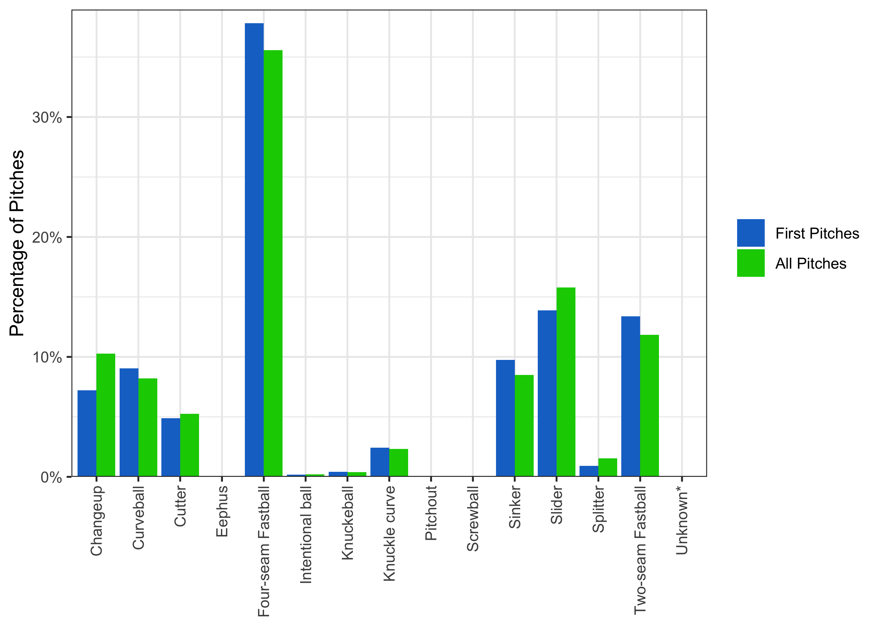
So the bias towards first pitch fastballs (both two- and four-seam) is actually even more pronounced on first pitches. Again, this may have to do with the goal of “setting up” other pitches, but it’s obviously the case that throwing a first pitch fastball every time cannot be optimal. However, to assess whether pitches are randomizing properly, we need to have a payoff metric that is more holistic than total bases. This measure has multiple obvious shortcomings, but the clearest one is that it doesn’t factor in balls – a pitcher who throws outside the strike zone every time may look extremely good by total bases, but is obviously not doing well.
A basic way to account for this is to use situational expected runs. Luckily for me, someone has done this – check out this site here. They’ve basically looked at every game since 1957, and for each possible situation (a situation being defined as the runners on base, outs, and count), looked at how many runs wound up being scored in an inning. A better metric of payoff per pitch, then, is how the expected runs change pitch-by-pitch.
First, we need to pull the raw data and parse it:
match_str <- '\\((\\d), \\((\\d), (\\d), (\\d)\\), \\((\\d), (\\d)\\)\\)'

expected_runs <- read_file('https://raw.githubusercontent.com/gregstoll/baseballstats/master/runsperinningballsstrikesstats') %>%
  str_split('\n') %>%
  unlist() %>%
  data.frame() %>%
  rename(text = 1) %>%
  mutate(situation_raw = str_extract(text, '(?<=^).*(?=\\:)'),
         run_dist_raw = str_extract(text, '(?<=\\[).*(?=])'),
         run_dist = str_split(run_dist_raw, ',')) %>%
  unnest(run_dist) %>%
  mutate(run_dist = as.numeric(run_dist)) %>%
  distinct(situation_raw, run_dist) %>%
  group_by(situation_raw) %>%
  mutate(runs = row_number() - 1) %>%
  ungroup() %>%
  group_by(situation_raw) %>%
  summarise(eruns = sum(runs * run_dist) / sum(run_dist)) %>%
  ungroup() %>%
  mutate(outs = as.numeric(str_match(situation_raw, match_str)[,2]),
         on_1b = as.numeric(str_match(situation_raw, match_str)[,3]),
         on_2b = as.numeric(str_match(situation_raw, match_str)[,4]),
         on_3b = as.numeric(str_match(situation_raw, match_str)[,5]),
         b_count = as.numeric(str_match(situation_raw, match_str)[,6]),
         s_count = as.numeric(str_match(situation_raw, match_str)[,7])) %>%
  select(-situation_raw)

head(expected_runs, 10) %>%
kable(caption = "Situational Expected Runs")| eruns | outs | on_1b | on_2b | on_3b | b_count | s_count |
|---|---|---|---|---|---|---|
| 0.4851488 | 0 | 0 | 0 | 0 | 0 | 0 |
| 0.4652575 | 0 | 0 | 0 | 0 | 0 | 1 |
| 0.4135659 | 0 | 0 | 0 | 0 | 0 | 2 |
| 0.5399889 | 0 | 0 | 0 | 0 | 1 | 0 |
| 0.4909568 | 0 | 0 | 0 | 0 | 1 | 1 |
| 0.4320186 | 0 | 0 | 0 | 0 | 1 | 2 |
| 0.6102356 | 0 | 0 | 0 | 0 | 2 | 0 |
| 0.5467988 | 0 | 0 | 0 | 0 | 2 | 1 |
| 0.4755414 | 0 | 0 | 0 | 0 | 2 | 2 |
| 0.7380154 | 0 | 0 | 0 | 0 | 3 | 0 |
From this, we can see that the first pitch thrown in an inning has a relatively small impact on the expected number of runs that inning; a strike brings the expected runs from about .485 to about .465, and thus decreases the expected runs by .02, while a ball brings the expected runs to about .54, which increases the expected runs by .055.
We need to merge this data onto out data. The b_count and s_count variables are demonstrably wrong in the 2019 data, and it spooked me for the other data, so I’m going to manually populate the count in a given at-bat by parsing it like this:
adj_pitch_counts <- full_data %>%
  select(g_id, ab_id, pitcher_id, batter_id, pitch_num, pitch_name, pitch_type,
         type, outs, on_1b, on_2b, on_3b, b_score, top, inning) %>%
  distinct() %>%
  mutate(in_play = type %in% c('X', 'D', 'E', 'H'),
         ball = type %in% c('B', '*B', 'I', 'P'),
         strike = type %in% c('S', 'C', 'F', 'T', 'L', 'M', 'Q', 'R')) %>%
  group_by(g_id, ab_id) %>%
  mutate(b_count = cumsum(lag(ball, default = FALSE)),
         s_count = cumsum(lag(strike, default = FALSE))) %>%
  ungroup() %>%
  mutate(s_count = ifelse(s_count > 2, 2, s_count))
We then just need to merge everything together:
relevant_data <- adj_pitch_counts %>%
  select(-in_play, -ball, -strike) %>%
  left_join(expected_runs,
            by = c('outs', 'b_count', 's_count',
                   'on_1b', 'on_2b', 'on_3b')) %>%
  group_by(g_id, inning, top) %>%
  mutate(lead_b_score = lead(b_score),
         lead_eruns = lead(eruns)) %>%
  ungroup() %>%
  mutate(lead_b_score = ifelse(is.na(lead_b_score), b_score, lead_b_score)) %>%
  group_by(g_id, inning, top) %>%
  mutate(eruns_added = lead_eruns - eruns + lead_b_score - b_score,
         eruns_added = ifelse(is.na(eruns_added), -eruns, eruns_added)) %>%
  ungroup()
What does this distribution look like?
ggplot(relevant_data %>%
         filter(!is.infinite(eruns_added))) +
  geom_histogram(aes(x = eruns_added), fill = 'dodgerblue3', color = 'white',
                 binwidth = .05, na.rm = TRUE) +
  scale_y_continuous(expand = expansion(mult = c(0,.03))) +
  labs(x = 'Expected Runs Added',
       y = 'Frequency') +
  theme_bw()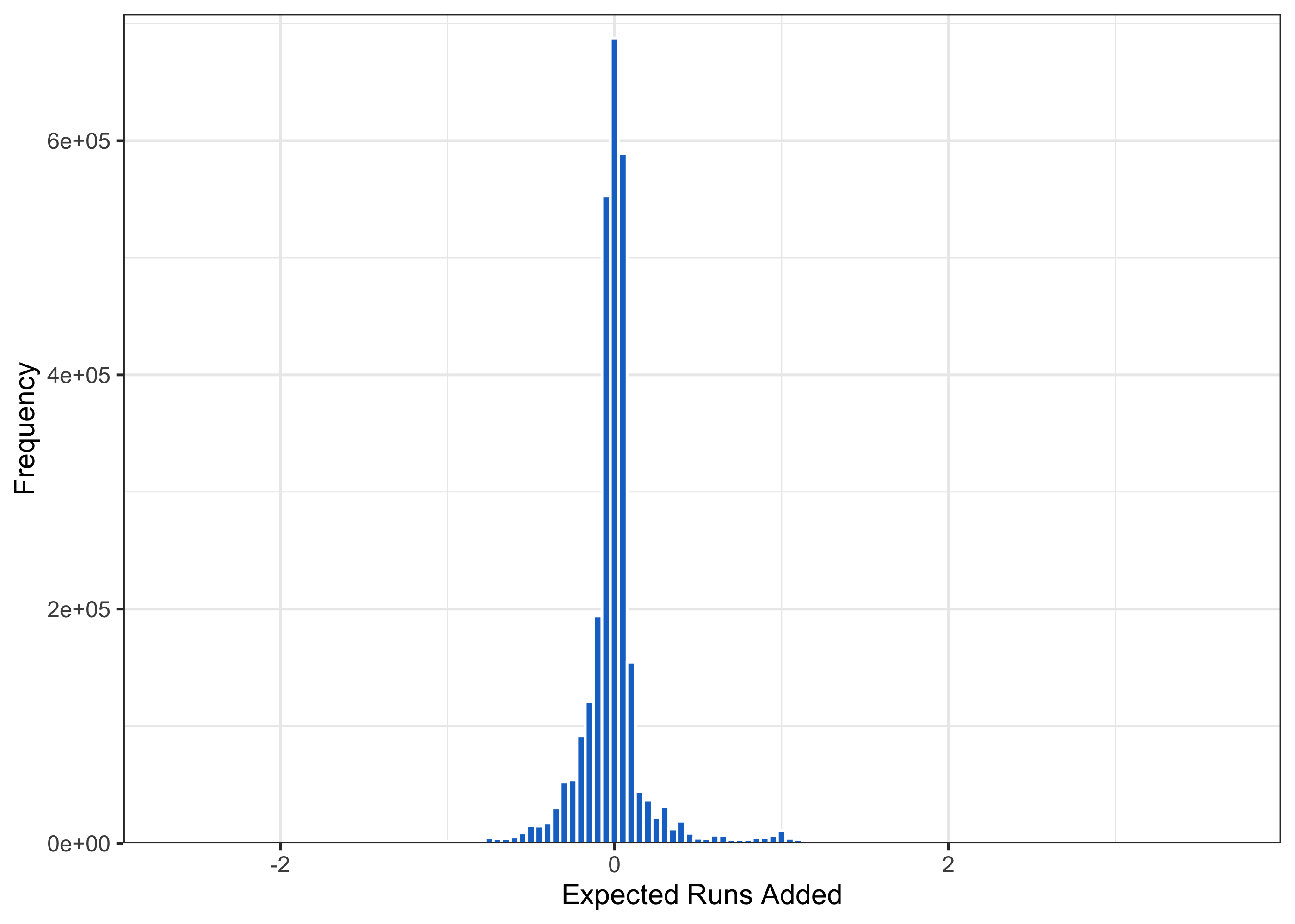
We see a lot of mass on 0 – these are foul balls on two strike counts, which do not change the situation, at least using the variables that we’re currently using. Further, note that there’s a small but noticeable mass right around 1 – these are solo home runs, where a run is added, and the situation is generally unchanged.
So using this rough measure, can we get any sense of whether pitchers randomize on their first pitch of an at-bat in a way that is consistent with the payoffs? Let’s take a pitcher like Clayton Kershaw as an example, since he has high volume.
kershaw <- unique(full_data[pitcher_first_name == 'Clayton' & pitcher_last_name == 'Kershaw']$pitcher_id)

relevant_data %>%
  filter(pitch_num == 1, pitcher_id == kershaw, !is.na(pitch_name)) %>%
  mutate(total_pitches = n()) %>%
  group_by(pitch_name, total_pitches) %>%
  summarise(n = n(),
            mean_eruns_added = mean(eruns_added)) %>%
  ungroup() %>%
  mutate(perc = n / total_pitches) %>%
  arrange(desc(perc)) %>%
  mutate(perc = percent(round(perc, 3)),
         mean_eruns_added = round(mean_eruns_added, 4)) %>%
  select(pitch_name, n, perc, mean_eruns_added) %>%
  kable(caption = 'Clayton Kershaw First Pitches',
col.names = c('Pitch', 'N', 'Percentage of Total', 'Mean Expected Runs Added'))| Pitch | N | Percentage of Total | Mean Expected Runs Added |
|---|---|---|---|
| Four-seam Fastball | 1882 | 68.40% | 0.0092 |
| Slider | 676 | 24.60% | 0.0017 |
| Curveball | 137 | 5.00% | 0.0004 |
| Two-seam Fastball | 53 | 1.90% | 0.0030 |
| Changeup | 2 | 0.10% | 0.0707 |
| Intentional ball | 1 | 0.00% | 0.0317 |
So Kershaw throws a first pitch fastball very often – more than two thirds of the time. But using this payoff metric, this pitch is actually the worst option of his first pitches; a fastball for him on the first pitch averages .009 expected runs added, which is larger than every other large sample pitch. So he throws his worst pitch most often? That’s the opposite of game theory optimal!
There are clearly a bunch of ways that this analysis could be flawed. If these really are setup pitches, then maybe we’re just looking at a subgame that doesn’t really exist – maybe if we look at these choices in the context of the at-bat, they’re optimal. Further, maybe these estimates aren’t actually differentiable from one another. Is there really a difference to Kershaw between .009 runs and .001 runs? Can we even be confident that these differences are statistically meaningful?
Finally, we’re not taking into account leverage or batter characteristics. These are big ones! Generalizing this with more data will be important, and I’ll think more about the best way to do it.